Examples of Possible Color Schemes for Fitness
Color Schemes For Fitness Magazine:
Now that I have discussed the color schemes that would fit best with the fitness topic, it would be a good idea to provide an example of similar color schemes in order to get a visual representation. I discussed the ways that clothing and poses can affect the possible color schemes and I described exactly what color schemes could be used for the magazines. Using this information I was able to establish that each clothing and pose used is done with a purpose. That purpose is to set a tone for the magazine and for this reason I made three separate posts in order to dissect the importance of color schemes. Despite what it may seem, color schemes are in fact very important and must be attended to with much precaution. Now that the possibilities have been discussed it is time to show some examples.Examples:

This magazine incorporated my strategy of using the color of the outfit for the text. It provides for a much more vivid appearance and will gain more attention from the readers. The background was also a very good complement as it allows for the outfit and the woman to stand out.
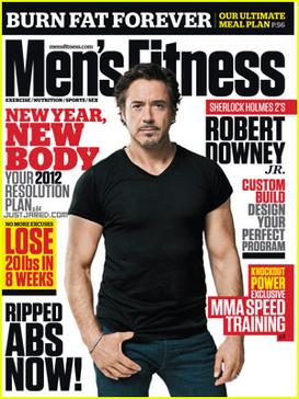
This is a good example of my statements about the use of black outfits. It is a very common and sought after color and allows for a great amount of customization due to the color's versatility. Not only did this magazine use a white background like I stated in my previous posts, but it used two of the text colors that I recommended for black outfits. This is an idea that I had not really thought about and I am glad I came across this as I now know that I have this option.
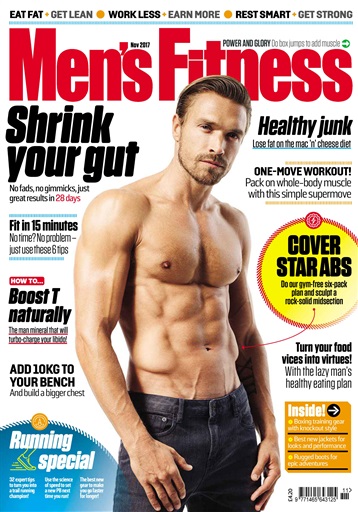
This is also a perfect example of what I stated to do for magazines that incorporated shirtless individuals. The white background usually complements the people very well and is why it is the most common background for these poses. This also incorporated two of the colors I suggested and it allowed for a very good contrast in colors.

Comments
Post a Comment