Possible Color Schemes for Fitness
Fitness Magazine
Now that the factors that affect the color scheme of fitness magazines have been discussed, it is time for me to discuss the possible color schemes that I could incorporate if I were to make a fitness magazine. I will be using the factors that I previously mentioned in order to come up with a good color scheme. I will provide possible cover picture ideas and poses in order to identify what color scheme I will use. After this analysis, I will provide real magazines that incorporated similar color schemes as I did and I will explain why they did so. This portion will be for my next post, however.
Possible Color Schemes
Arms Crossed:
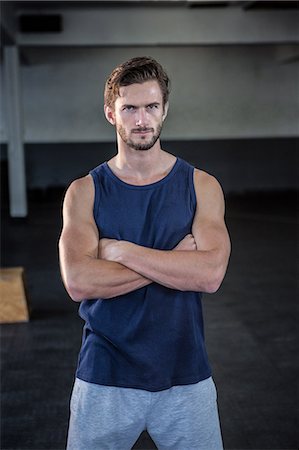

Thes types of pictures incorporate an aggressive tone and theme. By having athletic and fit individuals cross their arms they are incorporating a very unique pose. Possible Color Schemes for this are:
- Black Background Red Lettering
- Black Background Yellow Lettering
- Black Background White Lettering
- White Background Black Lettering
- White Background Red Lettering
Shirtless Poses:


- Black Background White Lettering
- Black Background Yellow Lettering
- White Background Red Lettering
- Black backgrounds (Depending on skin Complexion)

Comments
Post a Comment