Codes & Conventions of a Magazine
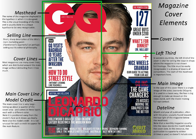
The next step in properly understanding how a magazine works is to learn the conventions and codes that make it up. This is something that I must learn in order to successfully create my magazine. The information that I obtained through research led me to this:

Masthead: When it comes to publishing, this term refers to the name of the magazine. This is a very important component of the magazine as it is one of the first things read and it also gives off the genre of the magazine.
Sell line: This is the statement made by the magazine that will try to convince someone to buy it. This is because it usually states any extra gains that a person will obtain from buying the magazine such as competitions or prizes.
Cover lines: These essentially serve as teasers as to what information is inside for the readers. They run down the sides of the magazine and is another technique to gain the attention of potential buyers.
Main image/central image: Just as the name implies, this is the central or main image of the magazine. Many times this is usually a picture of something very popular pertaining to the genre.
Date, barcode, price: All magazines should include these. The price should reflect the category (a, b, c1 or c2, d, e). of the primary target audience.
A strip along the top of the page: Includes information about more minor articles inside the magazine
Other things to consider:
Mode of address: Magazines can many times use genre-specific lexis which allows for the reader to feel special or exclusive. Hyperboles are many times used in order to incorporate exaggeration to make it more appealing, especially to younger audiences. A technique used is the direct mode of access which is done by having the character of the main image stare right at the audience.
The layout and design: This design can be formal or informal. This will depend on the house style of the magazine. The informal layout may include snapshots or paparazzi shots. While the formal layout may include photos that have been set up and taken in a studio.
Color: Magazines tend to have a house style that is used consistently. This can be created from a limited palette.
Font style and size: This is also related to the genre and can be sophisticated or cartoony, depending on the target audience.
Social media: Links to social media sites such as Facebook or Twitter are important and can prolong a reader's interest in the text.
References:
Ealey, Tony. “Codes and Conventions of Magazine Covers/Print.” Codes and Conventions of Magazine Covers/Print, 1 Jan. 1970, http://dlsa-ms-year12-2016.blogspot.com/2016/01/codes-and-conventions-of-magazine.html.
Comments
Post a Comment